
FIND FAMILY FUN IN...

Display Ad Can Go Here

Home

H1 on the page:
Family Fun on Long Island

four primary jobs for the home page:

Find something to do → Find a local business → Plan something → Discover useful content.

Rank Math SEO Title:
Long Island Kids Events, Activities & Family Fun | Your Local Kids

Meta Description:
Find family fun on Long Island, including kids events, activities, birthday parties, summer camps, education programs, family services and local businesses in Nassau and Suffolk Counties.

1. Hero: Find Family Fun on Long Island

I would change the hero from being mostly introductory/branding space into a navigation hero.

Keep the YLK personality and a short introductory statement, but immediately give parents three obvious choices:

Find Events | Find Local Businesses | Plan a Birthday

And somewhere prominent, maintain the Nassau / Suffolk choice. County is such an important part of how Long Island parents search that I would continue reinforcing it throughout the site.

I would not put a large amount of text in the hero.

2. Events & Activities — this should move WAY up

This is the biggest change I would make.

https://images.openai.com/static-rsc-4/0L_tbLxwp6L8VUYStZHfPuNf3j_l7hwXH98tnU4OCZmrY5-2yhlOfKoPwCjOHjMejjSLYe3N0Wi7Go7_Jee98686uW_g_ZM6Dk2rYoDAXZaSpeXJp8dKjkd6zzPGGGyFR85pShtXVTIzrn36Ek7rqxLBGWJL7CwMPWAvBfR8i_yI0nuWo0UEq1_W2RL95uM6?purpose=fullsize
https://images.openai.com/static-rsc-4/88CY5fPUEyehiYD9IMu1uQmcHqCq3iXuXXFcq1LEHPMWtWfELp_WwdC1A8d33uSxibieUGdb76cWadoV37NZoE3dOBlduyX0QowM0df3Wj0hi8POnK049t3qef_ouq15UQVCT-yQO664JBb_U9u9R4i9rZzK-Tm370h4Vqu3M3lp3dXLtcp5Ks6co7fI5M97?purpose=fullsize
https://images.openai.com/static-rsc-4/IY7TsFmbrcsRmep0u7psf0z1z9IJ0M9WI21l2NaZ-7p9Y5t-1N99Jz-jwU0atUek2p0Q-s7ab_FaWzXEzOQa_c4txbkLGu7oydtsjPPhvRJWZBhu1NSiI_o0B1CCzkKtVhRV_NG87rCoX8SmVfWLjk4Ddy6NR2-yeZZCFyzzghq2bYx7qvnyu8d825vMnxxZ?purpose=fullsize
8

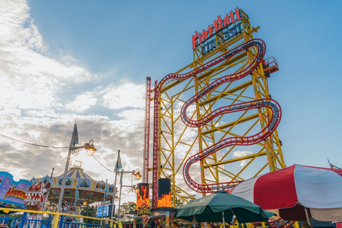
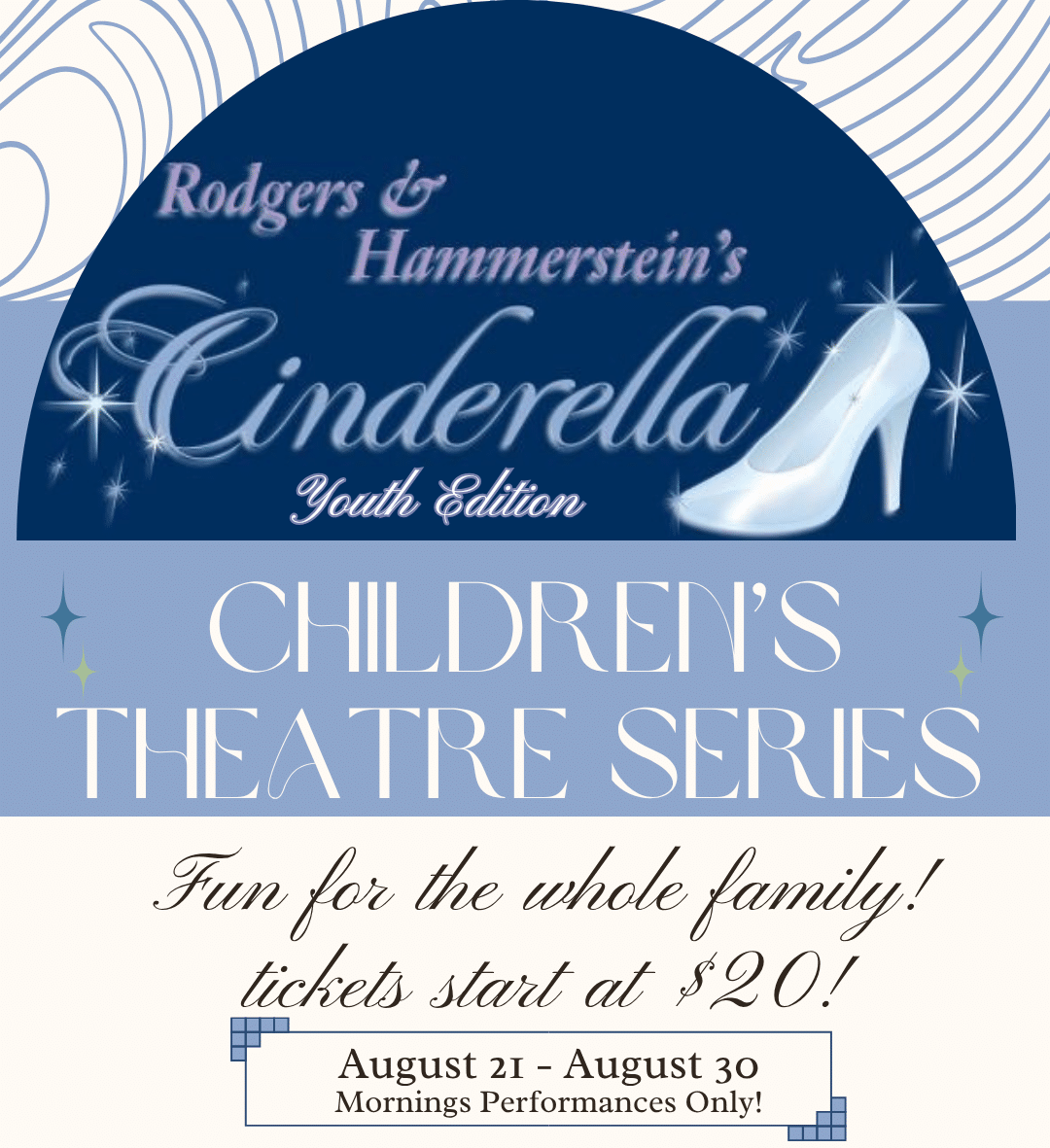
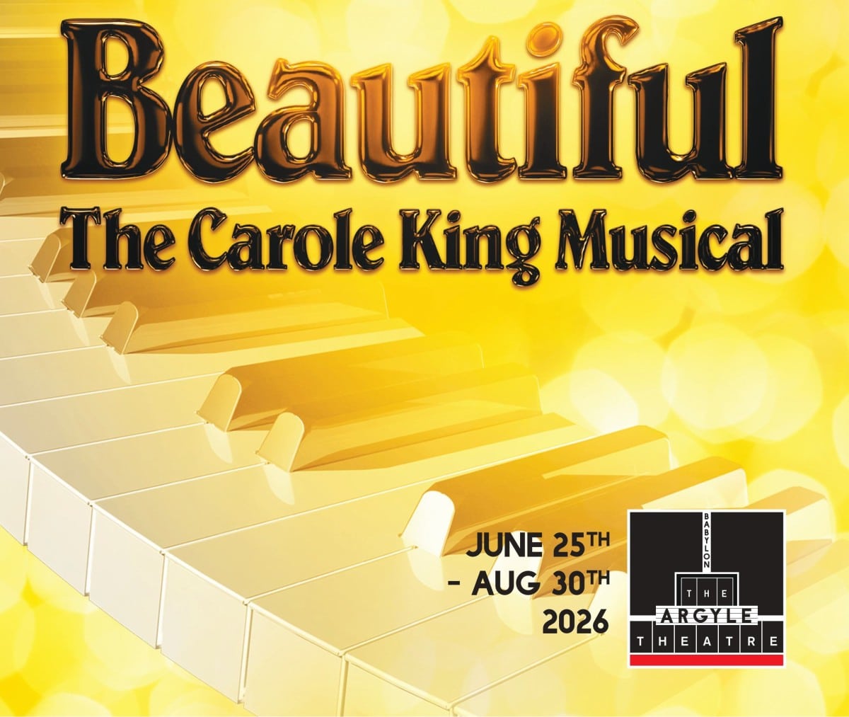
I like the basic idea in the NY Metro Parents screenshot, but I think we can make YLK’s version cleaner.

THIS WEEK ON LONG ISLAND

Across the top, perhaps have:

Today | Tomorrow | This Weekend | View Calendar

Then underneath, show 3 event cards.

Each card could have:

Event image
SAT JUL 25
Event Name
Location / Town
Nassau or Suffolk

Then a single:

View All Family Events →

This gives the calendar actual photography and personality instead of making it feel like a database.

And I would not put a giant calendar list on the homepage. Three events are enough. The homepage’s job is to get them into the calendar.

This also gives us a place later for a sponsored event without redesigning the homepage.

3. Find What Your Family Needs

This replaces the rather dry category list currently on the homepage.

The inspiration site’s Find Local Businesses is much better at communicating what someone can actually find.

I would use six visual cards:

   
🎂 Birthday Parties☀️ Summer Camps🎨 Classes & Activities
📚 Education❤️ Family Services🩺 Family Healthcare

But unlike NY Metro Parents, I don’t think each needs Nassau/Suffolk buttons underneath. That could become visually overwhelming.

Click Summer Camps, for example, and then the Summer Camp hub can offer Nassau/Suffolk and all its subcategories.

This section essentially becomes the beautiful front door to the cluster pages we have been building.

4. Birthday planning deserves its own feature

This is where the work we’re doing now pays off.

Instead of Birthday Parties simply being one of six boxes and disappearing, farther down we can have a horizontal feature:

Planning a Birthday?

A great photo/collage on one side and perhaps:

Venues · Entertainment · Party Rentals · Cakes & Treats

Plan the Perfect Birthday →

This drives people directly into the Birthday hub without dumping all those choices onto the homepage.

And next month or next year, another important hub could occupy this promotional space seasonally.

5. Ideas & Inspiration

Here I would borrow from Fun Guides + Day Trips + articles, but combine them.

We don’t need two giant article grids.

FAMILY FUN & IDEAS

One large featured story plus three smaller stories.

For example:

Large:
10 Great Things to Do With Kids This Weekend

Smaller:
A Great Long Island Day Trip
Indoor Fun for a Rainy Day
Best Places to Cool Off With Kids

Then:

Explore Family Fun & Ideas →

The content can change automatically based on your BL tags.

That makes all the work we did organizing the archive useful without turning the homepage into a blog archive.

6. Featured Local Businesses

I definitely think this belongs on the homepage, but not as the long text listing shown on NY Metro Parents.

YLK is much more visual now.

I’d use 4 business cards/logos maximum:

Logo/photo
Business Name
Very short category
Town
Learn More

Then:

Explore the Business Directory →

That is much more valuable to Jennifer’s advertisers, too. A featured advertiser actually looks featured.

Eliminate Sidebar

I would eliminate the traditional homepage sidebar.

The rotating graphic, Facebook box, newsletter, local resources, latest/popular articles, sponsored content, etc. are exactly how a useful homepage starts feeling busy.

Instead, use full-width sections and occasionally split them 70/30 when there is a reason.

For example, beside the Family Fun articles we could have a small:

Never Miss the Fun

Get family events and ideas delivered to your inbox.

Email Address
Sign Me Up

Then underneath:

Join 16,000+ parents following Your Local Kids on Facebook

That is a much stronger use of the Facebook following than embedding a Facebook feed or large social widget.

Footer


I would build a 4-column footer, followed by a very small bottom copyright bar.

Column 1 — Your Local Kids

YLK logo

A very short description:

Helping Long Island families find things to do, places to go, and trusted local resources in Nassau and Suffolk Counties.

Then the Facebook icon and any other social channels Jennifer actively maintains.

Column 2 — Find Family Fun

This is the parent-focused navigation.

Events Calendar
Things to Do
Birthday Fun
Summer Camps
Classes & Activities
Family Fun & Ideas

These should link to the major hubs, not individual articles.

Column 3 — Find Local Resources

This supports the directory side of YLK.

Business Directory
Education Programs
Family Healthcare
Family Services
Nassau County
Suffolk County

This also gives us nice sitewide internal links to the major areas we’re trying to strengthen for SEO.

Column 4 — Your Local Kids

This is the business/administrative side.

About Us
Advertise With Us
Submit an Event
Contact Us
View Latest Magazine

And I would put the newsletter signup here rather than giving it another homepage section:

Get the Fun in Your Inbox
Family events, activities and ideas from Your Local Kids.

[ Email Address ] SIGN ME UP


Then a narrow bar across the very bottom:

© 2026 Your Local Kids. All Rights Reserved. | Privacy Policy | Terms of Use

I would also include Accessibility if Jennifer has or plans to have an accessibility statement.

Visually, I would keep this very clean

I wouldn’t make it look like four giant lists of links. The headings could be your navy, links in a softer dark gray, with the YLK blue used for hover.

And I think this is one place where we can use the green from the YLK brand sparingly—perhaps a green top border or the column headings—to visually separate the footer from the page.

One thing I’d specifically leave out is the rotating promotional graphics currently in the sidebar. The new homepage navigation makes those unnecessary. The footer should be dependable navigation that stays the same everywhere, not another advertising area.

This also gives us a very clear division: header = primary navigation, homepage = discovery, footer = utility/navigation. That will make the rebuilt site feel much less cluttered than the old one.

Homepage TOC

So when I strip everything down, our page becomes:

NAVIGATION


HERO
Find Family Fun on Long Island
Find Events | Find Local Businesses | Plan a Birthday


EVENTS & ACTIVITIES
Today | Tomorrow | This Weekend
3 visual event cards
View Full Calendar


FIND WHAT YOUR FAMILY NEEDS
6 visual category cards


PLANNING A BIRTHDAY?
One strong promotional feature → Birthday hub


FAMILY FUN & IDEAS
1 featured + 3 articles


FEATURED LOCAL BUSINESSES
4 featured advertisers → Directory


STAY IN THE LOOP
Email signup + Facebook community

What’s Next

So my roadmap would be:

HOME → CALENDAR → BLOG TEMPLATE → DIRECTORY

I actually moved Blog Template ahead of Directory in the final sequence for one reason: effort versus payoff.

A good global blog template could transform hundreds of existing articles relatively quickly. Then tackle the directory as the next major structural project.

And there’s a nice psychological benefit to doing Home now: you get to design instead of migrate and organize data for a while. You’ve been living in categories, tags, locations, migration plugins and queries. The homepage lets all that behind-the-scenes work finally become a website.

Scroll to Top